Concentration 1: Street & Urban - PhotographyThis concentration is very well put together, it's all street and urban photography, so the theme is very visible. I don't know there is much growth, but what I did notice is that maybe the artist started with the grimy part of a city, but then started showing children and families and such. That might be a reach, but it later shows the "clean" parts of a city, if that makes any sense. They successfully showed different types of photography, like portrait, landscape, with it all being candid and unplanned. Concentration 2:This concentration all seems to be colored penciled, and they are photo-realistic drawings. Reflection is what really ties this all together, each piece has a part where there's some sort of reflection. I feel like there wasn't much evolution in the series, except one of them did stand out. It's more abstract, but still keeping the main point of the concentration. Overall it's a really good concentration. Concentration 3:  The theme is clearly shown throughout the concentration. Different angles and close ups make them all unique but still similar, very beautifully done in my opinion. I feel like some pieces could've gone a little further, like shading it a bit darker or making it seem more finished. I have some of my own ideas for my concentration. I want to do photography, and I want to do a common theme of urban but with nature mixed into it. Not sure yet but as I start on it my idea will probably evolve and change.
0 Comments
Klaus Pichler Klaus Pichler is a photographer known for his project called "One Third" which is a project about food waste. He has a large series of different foods that were kept past the expiration date and are clearly rotten and moldy. All of the photos in this series are very simple, the focus is on the food with a really pretty black background. He sets it up in a way where it looks like he's doing advertising for a certain type of food but instead it's all rotten. He created all of this because he wanted to show how much food goes to waste all throughout the world. kpic.at/images/2569 Cindy Wright Cindy Wright shows some really morbid detailed still lives. Most of her work has dead animals or meat shown in interesting ways, like a dead fish crammed into a fish bowl, or a butterfly being pinned up against a wall. She even has human skulls. She shows death in ways that shows it used to have life. She does realistic paintings of anything that represents death. http://www.cindywright.org/ Ori Gersht Ori Gersht is an artist that does a lot of still lives, but many of them show movement. He has a few pieces where a flower vase with flowers are exploding, and another piece called "Pomegranate" where a bullet is passing through the pomegranate. He shows the process of an object exploding through photography. As he says in his About page on his website, "Gersht approaches this challenge not simply through his choice of imagery, but by pushing the technical limitations of photography, questioning its claim to truth." 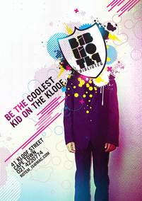 A good example of a design layout. A good example of a design layout. A good design typically consists of fonts that aren't obnoxious and hard to read, and be sure that the background isn't too busy and taking away from the main focus. When designing a poster, be sure that the composition flows nicely. If you have too many distracting photos that take away from the main subject of the poster, then simplify it and keep only the key ones. Also, if you have more than one image on it, be sure they all have a factor in common, like a color or filter. It makes the design aesthetically pleasing to look at. That goes for other parts of the poster as well, like the text. If the text all has different fonts and different colors that don't fit in a color palette, then that's a bad design layout. Also, keep it simple. Don't overdo it, like when giving information about what the poster is for, don't make it an essay. Keep it small and simple, but be sure to get your point across.  A bad example of a design layout. Every piece in this portfolio is very well put together. Not all of them are finished though, which is fine. But each piece so far is flawless and looks like the artist put a lot of time into it. Some of them have really cool concepts, but the portraits don't seem to have much of a story in my opinion. This artist has a lot of different medias, along with some mixed media. What I noticed is that the artist plays with shadows which makes the portrait very unique. The one in the top right is one of my favorite portraits, because of the soft colors on the face which makes it feel very abstract.
Cindy Sherman, Francesca Woodman, Annie LeibovitzCindy Sherman makes a lot of self portrait art, but in creative ways. She's had a series where she'd make it look like she's from a movie, and it looks like screenshots from a movie. Another one is where she paints her face with clown makeup. Her technique is taking unique self-portraits, instead of that common headshot. She has a range of mediums, like photography and painting. She's very specific in each piece. She shows creativeness and the unique side of her through her art. Francesca Woodman steered towards surrealism photography. She used the dark room to achieve these pieces. Each photo has deep meaning, it's not just cool crazy art. It's meaningful and deep. They can be interpreted in many ways, there's not just one set meaning behind each piece. Each piece is black and white, and she focuses on contrast for many of them. Annie Leibovitz is a current day commercial photographer, a lot of her art is celebrity photoshoots. She's dependent on the very bright lights and staged portraits of celebs. She's done Disney photography as well, she has a very wide range of different types. What I notice throughout her photography is the contrast in black and white photographs, and how much she focuses on color in her colored photographs. The Cedar Rapids Museum of Art
Modern Gallery & Framing Co
Art Cellar Gallery
|
CategoriesShane WonaseI'm a senior at Kennedy High School currently taking AP Studio & Digital Imaging. Archives
December 2017
Categories |


 RSS Feed
